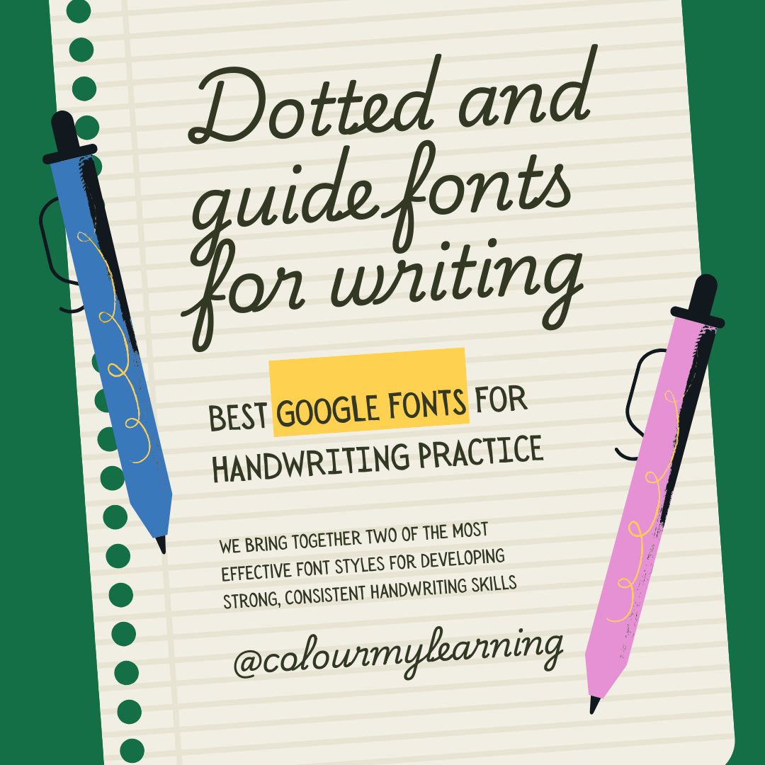
Best Dotted Fonts & Guides from Google Fonts for Handwriting Practice
We bring together two of the most effective font styles for developing strong, consistent handwriting skills. Dotted fonts provide a clear tracing path for each letter, guiding learners through the correct stroke sequence and helping them build muscle memory for letter shapes. Guides fonts go a step further by including handwriting lines; baseline, x-height, ascender, and descender directly in the design, showing learners exactly where each letter should sit and how tall it should be.
All the fonts featured in this guide are free to download from Google Fonts, making them simple to use in worksheets, classroom displays, educational apps, or home learning packs. They can be quickly integrated into popular platforms like Google Docs, Canva, and Word, so teachers, parents, and developers can create effective handwriting resources without extra cost or licensing worries.
These fonts are particularly valuable for:
- Early learners beginning to form letters.
- ESL students building familiarity with English letter shapes and writing flow.
- Occupational therapy programmes focused on fine motor skills and handwriting rehabilitation.
In this article, we’ll explore the difference between dotted fonts and Guides fonts, highlight the benefits of both, and share the best options available from Google Fonts to help make handwriting practice clear, consistent, and engaging.
What Are Dotted Fonts?
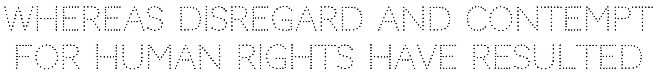
Dotted fonts are typefaces where each letter is made up of evenly spaced dots or an outlined pattern. They are specifically designed for tracing, giving learners a visual and tactile guide to follow.
Purpose:
- Show learners the correct path for writing each letter.
- Reinforce shape, proportion, and spacing in handwriting.
- Support the development of stroke accuracy and handwriting fluency.
How They Help: By tracing dotted letters, students strengthen fine motor skills, improve letter recognition, and build the confidence to write letters independently. The consistent visual cue helps learners focus on accuracy without the distraction of extra design elements.
Examples of Use:
- Printable tracing sheets for home or school.
- Interactive tracing apps for tablets and whiteboards.
- Classroom handwriting posters showing correct forms to emulate.
What Are Guides Fonts?
Guides fonts include built-in handwriting guidelines—such as the baseline, x-height, ascender line, and descender line—as part of the font design. These lines mirror those found in handwriting exercise books.
Purpose:
- Teach learners exactly where letters sit on a line.
- Reinforce the relative heights of lowercase letters, capitals, and ascenders.
- Provide a consistent reference for proportions and spacing.
Educational Benefit: By combining the letterform with guide lines, Guides fonts make it easier for learners to visualise positioning while practising letter shapes. This is particularly helpful when transitioning from unjoined print to cursive or when correcting uneven handwriting.
Spotlight – Playwrite Guides Fonts on Google Fonts:
- Examples: Playwrite México Guides, Playwrite AU SA Guides, Playwrite NZ Guides.
- Aligned with real handwriting curricula from different regions.
- Suitable for both beginners and students refining their handwriting.
Best Dotted and Guides Fonts from Google Fonts
Below is a curated selection of dotted fonts and Guides fonts from Google Fonts that are particularly effective for handwriting practice.
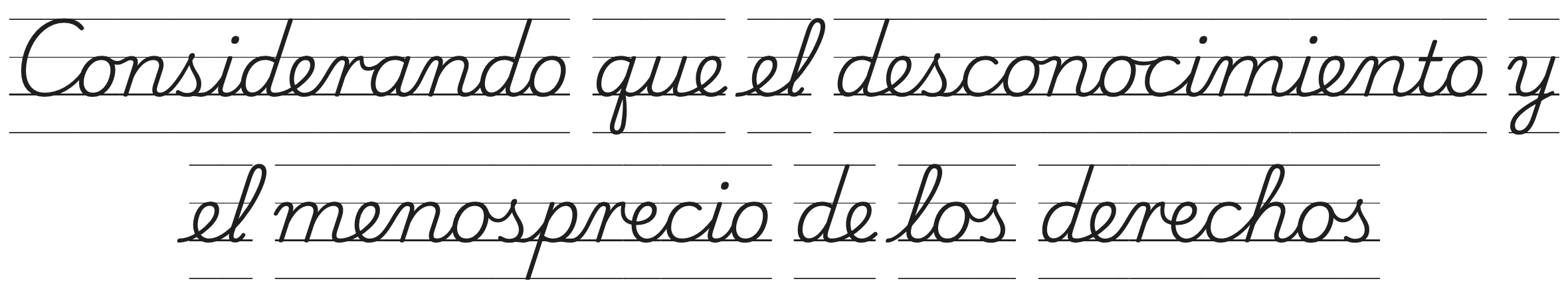
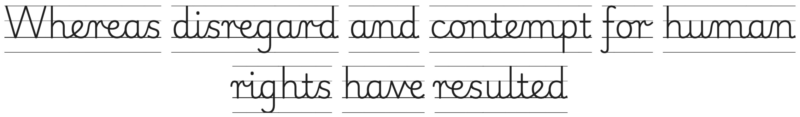
1. Playwrite México Guides
Why it’s great for handwriting practice: Designed to teach beginner cursive in Mexico, this style combines dotted letterforms with proportional guidelines to help learners master joins, slant, and spacing.
Best for: Cursive handwriting workbooks, guided practice sheets, regional curriculum alignment.
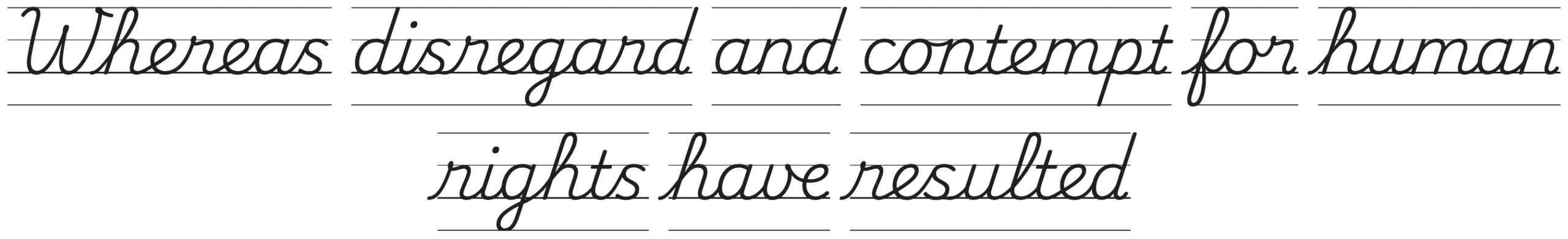
2. Playwrite AU SA Guides
Why it’s great for handwriting practice: Matches the South Australian school handwriting standard, complete with dotted guides for tracing. The joins are gentle, and spacing is generous for clarity. Note that this is similar to Playwrite New Zealand Guides and Playwrite Australia Victoria Guides and Playwrite Australia SA Guides.
Best for: Australian curriculum-based worksheets, school handwriting programmes, home learning packs.
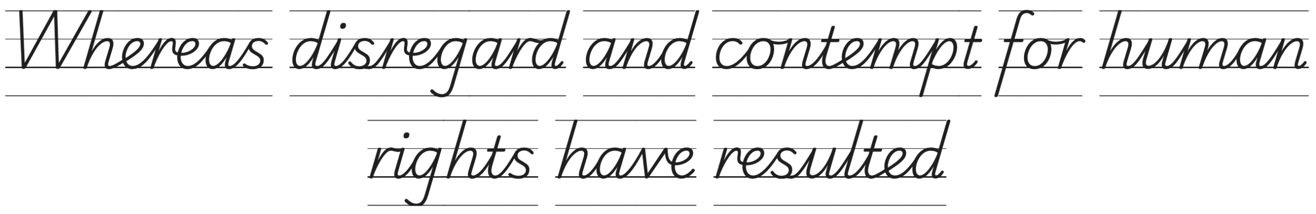
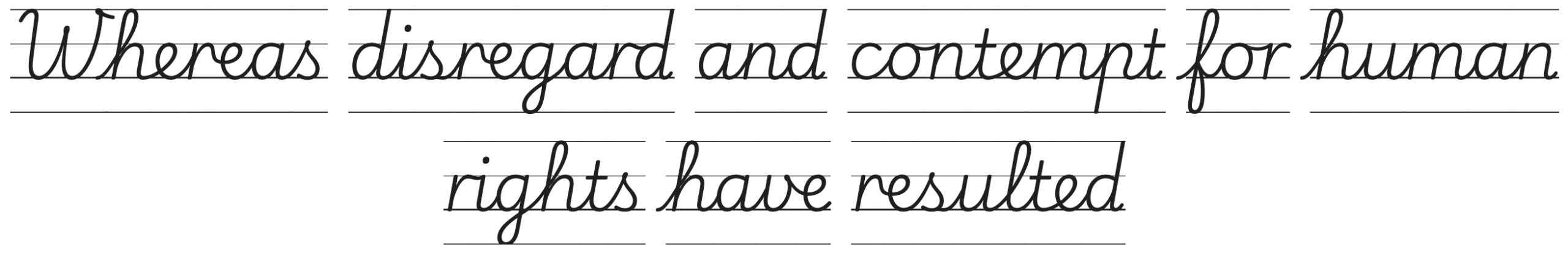
3. Playwrite England SemiJoined Guides
Why it’s great for handwriting practice: Features an upright script with pointed “v” shapes and semi-joined cursive, following English handwriting guidance. Built-in guide lines help learners transition from print to a neater joined style. Also available in a fully joined version as Playwrite England Joined Guides.
Best for: UK primary school handwriting instruction, regional curriculum worksheets, and transition-stage practice books.
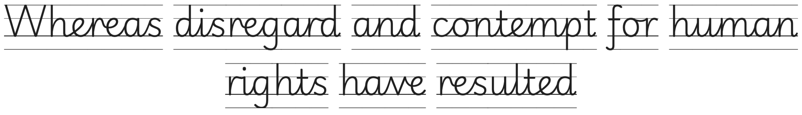
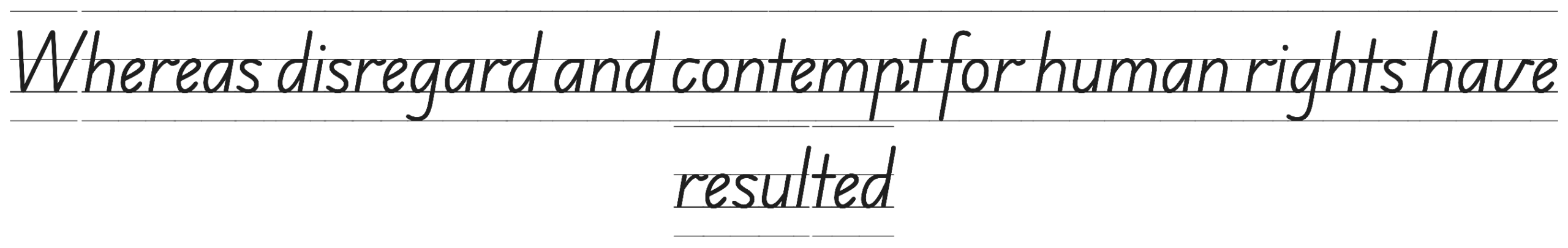
4. Playwrite India Guides
Why it’s great for handwriting practice: Similar to Playwrite Canada Guides but with a distinctive cursive “r” and “v” this style is tailored to handwriting conventions in India. The built-in guide lines support uniform letter height and spacing.
Best for: Indian school resources, printable tracing sheets, and ESL handwriting programmes.
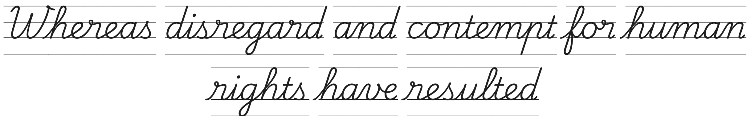
5. Playwrite USA Modern Guides
Why it’s great for handwriting practice: A modern American cursive style with integrated guide lines for consistent baseline placement and smooth letter joins. Its clean, upright, open shapes make it easy to read and trace.
Best for: US-based handwriting workbooks, educational apps, and homeschool practice sheets.
6. Playwrite Ireland Guides
Why it’s great for handwriting practice: Matches the Irish school handwriting standard, with built-in guide lines to support correct letter height and spacing. Its rounded, friendly joins make it especially approachable for younger learners. This is similar to Playwrite USA Traditional Guides and Playwrite Tanzania Guides. The Ireland Guides has the round bottom “v” different to India but special cursive “r”.
Best for: Irish curriculum worksheets, home learning packs, and handwriting transition activities.
7. Playwrite South Africa Guides
Why it’s great for handwriting practice: Based on South Africa’s official school handwriting style, this Guides font includes baseline and proportion lines to help learners position and size their letters accurately. Clear joins make it ideal for mastering cursive flow. It uses the ‘normal’ “r” but applies the rounded bottom “v” with an italic slant.
Best for: Curriculum-aligned resources, school workbooks, and guided handwriting posters.
8. Edu Australia VIC WA NT Hand Dots
Why it’s great for handwriting practice: A hand-drawn dotted version of the Victoria, Western Australia, and Northern Territory handwriting standard. The organic line style gives a softer look while still preserving correct proportions and joins for accurate letter formation.
Best for: Informal handwriting practice sheets, blended literacy/art activities, and engaging classroom displays.

9. Edu Australia VIC WA NT Hand Guides
Why it’s great for handwriting practice: Follows the handwriting standard for Victoria, Western Australia, and Northern Territory. Clear joins and proportional dotted guides make tracing straightforward.
Best for: Regional school resources, printable tracing workbooks, home practice.
10. Codystar
Why it’s great for handwriting practice: An uppercase dotted display font that works well for creative tracing exercises. Not a curriculum font, but its simplicity makes it accessible for early learners.
Best for: Fun activity books, eye-catching poster titles, handwriting warm-ups.
11. Raleway Dots
Why it’s great for handwriting practice: A dotted version of the popular Raleway sans-serif font. Its geometric shapes and clean design make it suitable for both children and adults practising print-style writing.
Best for: ESL handwriting sheets, modern tracing templates, digital practice apps.

Benefits of Using Dotted and Guides Fonts for Beginners
- Enhances letter recognition – Learners see and repeat correct shapes, building familiarity and speed.
- Builds fine motor control – Tracing encourages precise hand movements and grip control.
- Offers a visual guide without overwhelming the learner – Minimalist design keeps focus on letter formation.
- Reinforces correct proportions and spacing – Especially important in early handwriting development.
- Encourages independent freehand writing over time – As learners gain confidence, they naturally move from tracing to creating letters independently.
How to Access Dotted and Guides Fonts on Google Fonts
Finding and downloading dotted or Guides fonts on Google Fonts is quick and straightforward. Follow these steps:
- Go to Google Fonts: The entire library is free to browse, preview, and download.
- Search by name: If you know the font you want (e.g., Playwrite México Guides), simply type it into the search bar.
- Filter your search
- Use keywords like “Guides” or “Dots” in the search bar to find dotted or lined handwriting fonts.
- You can also browse by category (Handwriting or Display) to discover script-style dotted fonts.
- Preview the font: On the font’s page, type your own text into the preview box to see how it looks. You can adjust the font size slider for a better view.
- Download the font: Click the Download family button to save the font files to your device. This will include all available styles—solid, dotted, and Guides versions—if they exist.
- Install and start using: Once installed on your computer, the font will be available in applications such as Microsoft Word, Google Docs, Canva, and Adobe Illustrator.
Licensing note: All Google Fonts are released under the SIL Open Font License, which means they are free to use for both personal and commercial projects. You can include them in worksheets, workbooks, educational apps, and printed classroom materials without restriction.
Tips for Using Dotted Fonts Effectively
- Use large font sizes for beginners Start with 18–24 pt for printed worksheets so learners have enough space to form letters accurately. Reduce size as confidence and control improve.
- Ensure high contrast Dark dots (black or navy) on a white background are easiest for learners to follow. Avoid pale colours that may reduce visibility.
- Add directional arrows Where possible, include stroke direction indicators, especially for younger students or learners unfamiliar with the alphabet’s writing flow.
- Print on uncoated paper Uncoated paper prevents pencil smudging and improves friction for better grip.
- Pair dotted fonts with solid-letter practice After tracing dotted letters, offer a line of solid letters for freehand writing. This helps transition from guided tracing to independent handwriting.
Dotted and Guides fonts are more than just decorative typefaces—they are purpose-built teaching tools that make handwriting practice clearer, more structured, and more engaging. Dotted fonts provide a visible path for tracing, helping learners develop muscle memory, improve fine motor control, and gain confidence in forming each letter. Guides fonts take this a step further, incorporating handwriting lines irectly into the design so students can see exactly where letters sit and how tall they should be.
By using these fonts in worksheets, apps, posters, and classroom displays, educators and parents can create consistent, curriculum-aligned handwriting resources without needing specialist software. And because all the fonts in this list are available for free from Google Fonts, they’re easy to access, share, and adapt for any learning environment.
Every learner is different, so don’t be afraid to experiment with several dotted or Guides fonts to see which style feels most natural and effective for your students. Whether you’re teaching early print, cursive joins, or supporting handwriting rehabilitation, the right font can make practice sessions more productive and enjoyable.
For more inspiration and font recommendations, explore our related handwriting guides:
- Best Cursive Fonts for Learners & Beginners
- Best Dotted Fonts & Guides from Google Fonts for Handwriting Practice [HERE]
- Move Over Comic Sans – Best Fonts to use for Learners and Beginner Writers
- Best Handwriting Fonts from Google Fonts for Students and Educators
With the right tools—and the right font—handwriting practice becomes not just a task, but a skill-building activity that learners can truly enjoy.
If you find this useful, please share it on.