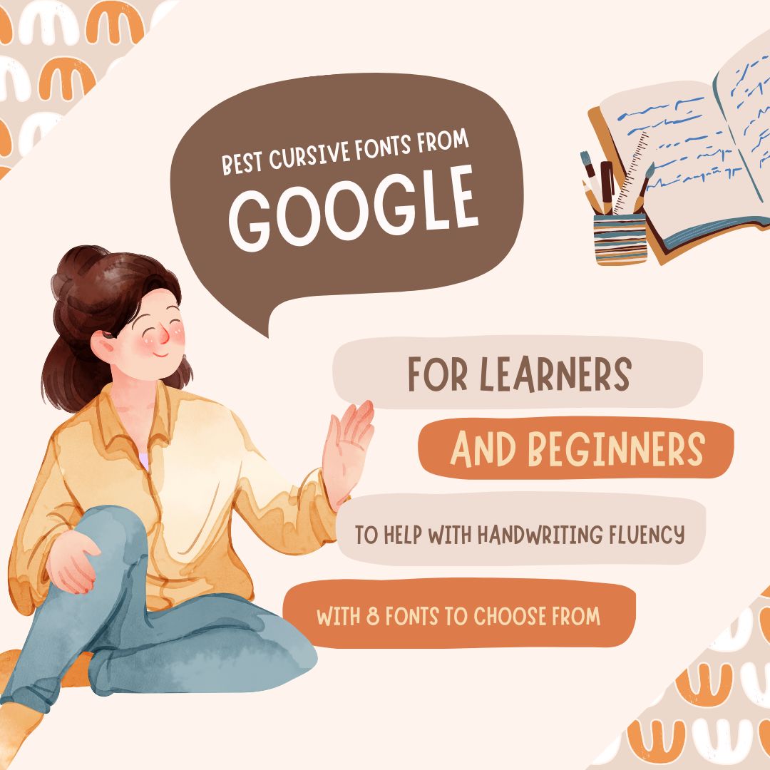
Best Cursive Fonts from Google Fonts for Learners & Beginners
In an age where keyboards dominate our daily communication, handwriting might seem like a fading skill. Yet, there has been a renewed interest in bringing it back, not only for its nostalgic charm but for its proven educational benefits. Schools, parents, and tutors alike are recognising that cursive writing plays a unique role in building confidence, fine motor skills, and fluency.
For learners and beginners, the right font can make all the difference. That’s where the best cursive fonts from Google Fonts come in. These free, high-quality typefaces offer educators, parents, and students accessible tools to create worksheets, posters, and practice materials that encourage clear, connected handwriting. Whether used in a classroom or at home, they can turn handwriting practice into an engaging, confidence-building experience.
Why Cursive Fonts Help with Handwriting Fluency
Cursive writing is more than just a stylistic choice, it’s a valuable learning aid. Studies show that practising joined-up writing can help strengthen memory retention, develop fine motor skills, and improve writing speed over time. Each flowing letter connection trains the hand to move smoothly and rhythmically, reducing hesitation between strokes.
When learners practise using a well-designed cursive font, they are exposed to consistent letter joins and shapes. This repetition helps form muscle memory, making writing more automatic and less mentally taxing. It also bridges the gap between printed handwriting and a mature, fluid writing style.
Cursive fonts are especially useful in:
- Transition periods: when a student moves from block print to joined writing.
- Improving legibility: refining letter shapes and spacing for neatness.
- Rehabilitation: helping those recovering handwriting skills after injury or illness.
Key Features of Beginner-Friendly Cursive Typefaces
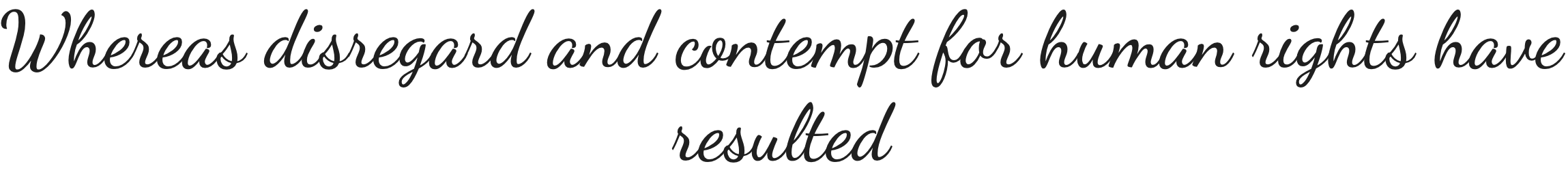
Not all cursive fonts are created equal, especially when it comes to teaching beginners. Choosing the right one means focusing on legibility and functional design rather than ornate flourishes.
- Readability: – The strokes should be clean and well-defined, avoiding excessive swirls or loops that could distract learners.
- Letter Joins: – Joins should be consistent, clearly showing where one letter connects to the next, so students can replicate them easily.
- Spacing: – Adequate kerning (space between letters) and line spacing help prevent letters from appearing cramped, making tracing and copying easier.
- Letter Forms: – Fonts should follow traditional, curriculum-aligned shapes so learners can transfer their skills from practice sheets to real-world writing.
What to avoid: overly stylised scripts with exaggerated flourishes, inconsistent joins, or irregular letter proportions. While these can be beautiful in design projects, they often confuse learners and disrupt handwriting development.
Top Cursive Fonts from Google Fonts
All of the fonts below are free and can be downloaded directly from Google Fonts. They are easy to install and work on any computer, tablet, or design program, making them perfect for creating classroom worksheets, posters, and practice materials. Use the links to open the Google Fonts to get the font.
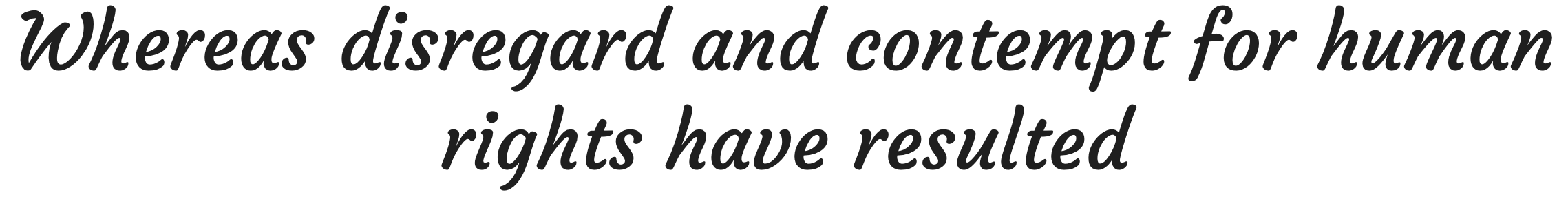
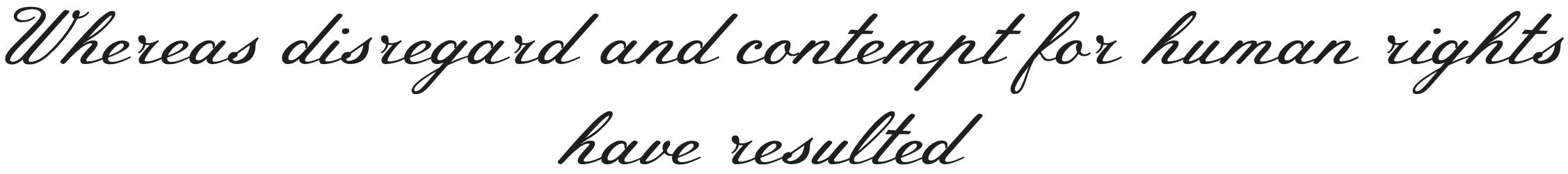
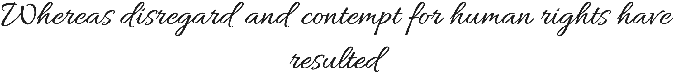
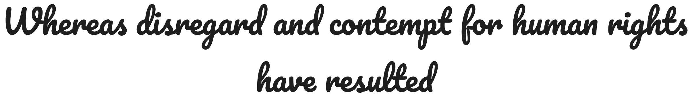
1. Dancing Script
Why it’s great for beginners: Dancing Script is a casual cursive font with smooth, rounded letters and moderate joins, making it less intimidating for learners. Its shapes are clear, and the slight slant adds a natural handwriting feel without sacrificing readability.
Best for: Early cursive practice, handwriting posters, informal certificates.
Sample sentence for visual:
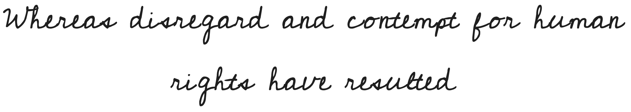
2. Courgette
Why it’s great for beginners: Courgette offers a slightly more formal cursive style with consistent letter connections and open shapes. It works well for practising even spacing while still feeling friendly and approachable. It is however disjointed cursive.
Best for: Practice worksheets, school displays, reading materials with a personal touch.
Sample sentence for visual:
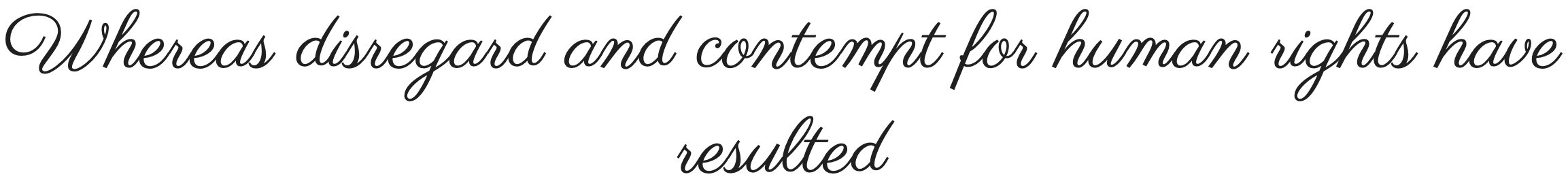
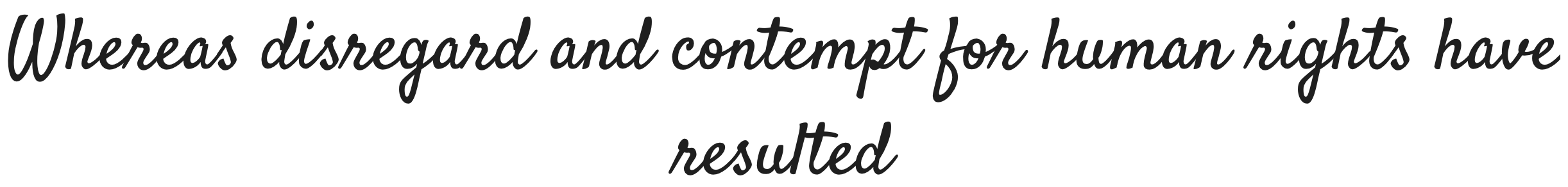
3. Parisienne
Why it’s great for beginners: Parisienne is elegant but still easy to read. It has clear letterforms, light strokes, and gentle curves, making it ideal for students who are ready for a slightly more refined cursive without complex flourishes.
Best for: Special event materials, classroom awards, and advanced cursive handwriting practice.
Sample sentence for visual:
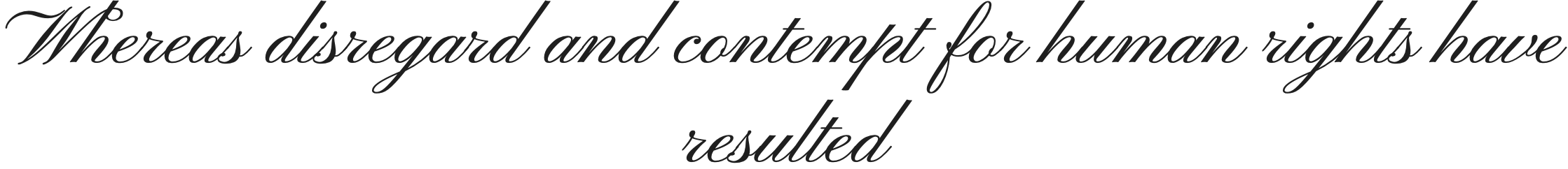
4. Great Vibes
Why it’s great for beginners: While more decorative, Great Vibes keeps its joins consistent and its letter shapes recognisable. It can be a fun option for creative writing exercises or projects where presentation matters as much as legibility.
Best for: Certificates, creative writing pieces, and decorative classroom headings.
Sample sentence for visual:

5. Sacramento
Why it’s great for beginners: Sacramento is a monoline, semi-connected cursive font. Because it’s lighter on the joins, it’s a useful bridge for students transitioning from print to cursive—giving them a taste of connected writing without fully committing to complex letter links.
Best for: Transitional practice, journaling prompts, and personalised name tags.
Sample sentence for visual:

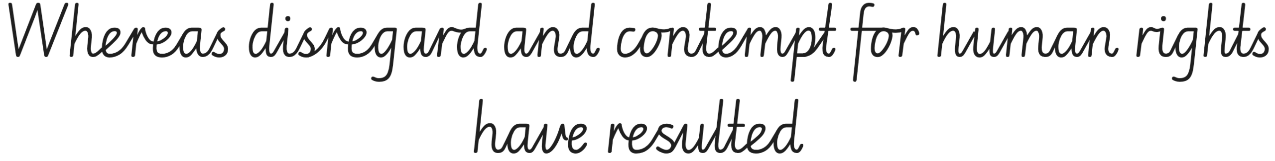
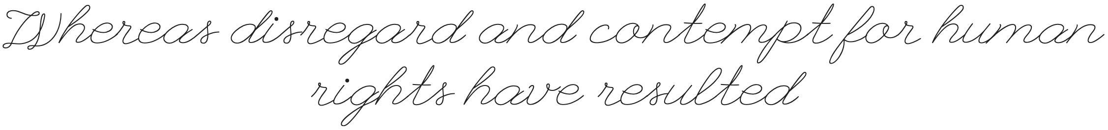
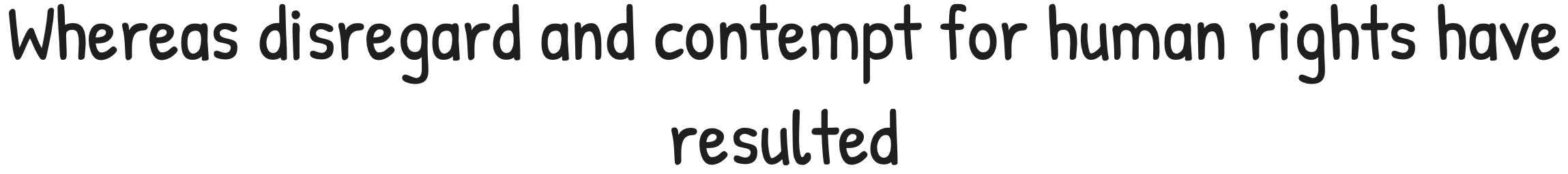
6. Edu NSW ACT Hand Cursive
Why it’s great for beginners: Edu NSW ACT Hand Cursive is specifically designed to match the handwriting style taught in Australian schools, with clear letterforms, gentle curves, and consistent spacing. It supports learning correct letter joins and proportions, making it a strong educational tool.
Best for: Classroom handwriting resources, learner worksheets, early handwriting apps.
7. Pinyon Script
Why it’s great for beginners: Pinyon Script is a formal, round-hand cursive with graceful, flowing strokes. While it is more decorative, its consistent rhythm and well-defined shapes can help learners explore letter connections in a more sophisticated style.
Best for: Certificates, formal invitations, title headers in educational materials.
8. Rouge Script
Why it’s great for beginners: Rouge Script blends vintage elegance with smooth, easy-to-follow strokes. Its generous spacing and moderate contrast make letterforms clear while still giving learners a taste of decorative cursive.
Best for: Headings in creative projects, signage, art-based learning resources.

9. Meie Script
Why it’s great for beginners: Meie Script has a gentle, natural flow with rounded letterforms and soft joins. It’s casual yet structured, making it comfortable for learners to read and emulate without feeling overly stylised.
Best for: Informal posters, creative writing prompts, cursive handwriting practice.
10. League Script
Why it’s great for beginners: League Script combines a relaxed brush style with clear, open letters that avoid overly tight loops. This makes it accessible for learners while still delivering a lively, handwritten look.
Best for: Greeting cards, classroom bulletin boards, handwriting activities.
11. Meow Script
Why it’s great for beginners: Meow Script features playful, rounded strokes and generous curves that echo friendly handwriting. Its letterforms are distinct, making it both approachable for reading and inspiring for early cursive learners.
Best for: Children’s activity sheets, friendly branding, fun classroom displays.

12. Clicker Script
Why it’s great for beginners: Clicker Script offers smooth, flowing strokes with moderate slant and clear joins. Its casual elegance makes it easy to read while giving learners a sense of rhythm in cursive writing.
Best for: Title pages, creative headings, introductory cursive lessons.

13. Imperial Script
Why it’s great for beginners: Imperial Script is a formal, upright cursive with graceful swashes and well-spaced letters. While decorative, its generous spacing keeps letter shapes distinct, helping learners understand more ornate cursive forms.
Best for: Certificates, awards, formal event signage.

14. Playwrite México Guides
Why it’s great for beginners: Playwrite México Guides is part of the Playwrite superfamily designed for handwriting instruction, featuring letterforms with guides and proportions suited for practice. It’s ideal for teaching proper slant, joins, and shape consistency.
Best for: Handwriting workbooks, guided practice sheets, classroom wall charts.
15. Allura
Why it’s great for beginners: Allura has smooth, slightly formal strokes with consistent letter heights and clean loops. It feels polished yet remains simple enough for learners to follow without confusion.
Best for: Subheadings, greeting cards, decorative worksheets.
16. Pacifico
Why it’s great for beginners: Pacifico’s bold, rounded letters and connected strokes give it a retro feel while staying legible. Its friendly style makes cursive approachable for children and beginner calligraphers.
Best for: Informal posters, playful branding, classroom displays.
17. Style Script
Why it’s great for beginners: Style Script draws from mid-century cursive styles, offering upright strokes and open loops. It’s decorative yet clear enough for learners to explore stylistic variation in cursive.
Best for: Creative project headings, art displays, cursive style exploration.

18. Cedarville Cursive
Why it’s great for beginners: Cedarville Cursive is based on a teacher’s handwriting, featuring clean, open letters with a natural classroom feel. It’s perfect for helping students transition from print to cursive.
Best for: Early handwriting sheets, educational posters, name tags.
Alternatives That Are Not Fully Cursive but Still Useful for Practice
If you want something between print and cursive, consider Satisfy or Patrick Hand or Homemade Apple. These fonts are friendly, legible, and have handwriting-like qualities that make them suitable for early writing practice, even if they don’t have full letter joins. They’re excellent for building familiarity with letter shapes before moving on to true cursive styles.
19. Satisfy
20. Patrick Hand
21. Homemade Apple
For more inspiration and font recommendations, explore our related handwriting guides:
- Best Cursive Fonts for Learners & Beginners [HERE]
- Best Dotted Fonts & Guides from Google Fonts for Handwriting Practice
- Move Over Comic Sans – Best Fonts to use for Learners and Beginner Writers
- Best Handwriting Fonts from Google Fonts for Students and Educators
If you find this article useful, please share it on.