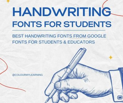
Best Child-Friendly Print Fonts from Google Fonts for Early Readers
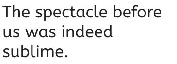
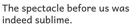
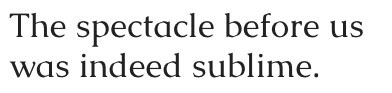
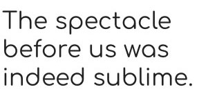
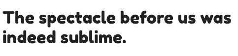
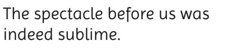
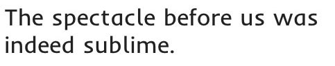
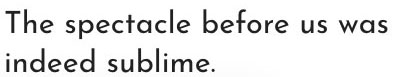
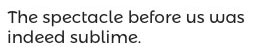
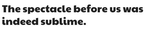
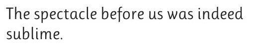
When creating reading materials for young learners, font choice matters. For early readers, a single-storey “a” (ɑ) is preferred because it matches the handwritten form children are taught, making it easier for them to recognise and reproduce letters. The best fonts for this age group are clear, spacious, and free from distracting flourishes, ensuring that each letter is instantly recognisable.
Below is a list of child-friendly print fonts from Google Fonts that combine excellent readability with single-storey “a” letterforms—ideal for flashcards, early reading books, and phonics worksheets.
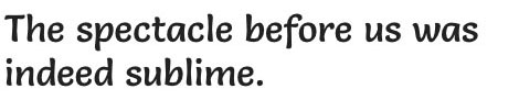
1. ABeeZee
Why it’s great for early readers: Specifically designed for children, ABeeZee is friendly and open, with clear shapes and wide spacing that make reading effortless.
Best for: Early years worksheets, beginner phonics materials, primary classroom displays.
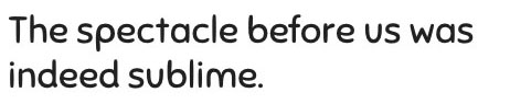
2. Andika
Why it’s great for early readers: Created with literacy and legibility in mind, Andika has generous spacing, distinct letterforms, and excellent clarity for small print.
Best for: Reading intervention materials, large-print beginner books, multilingual resources.
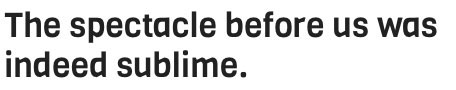
3. Amaranth
Why it’s great for early readers: Soft curves and friendly proportions make Amaranth inviting while maintaining strong readability for beginners.
Best for: Storybooks, classroom charts, friendly educational posters.
4. Bree Serif
Why it’s great for early readers: A serif font with gentle curves, Bree Serif combines personality with clear letterforms for young readers transitioning to more formal text.
Best for: Early chapter books, reading comprehension sheets, literacy programme branding.
5. Carter One
Why it’s great for early readers: Bold, rounded shapes and even weight make Carter One a strong choice for large headings and beginner-friendly signage.
Best for: Classroom labels, book covers, early years display boards.
6. Caudex
Why it’s great for early readers: This transitional serif font balances classic letterforms with open counters, aiding clarity in both print and digital formats.
Best for: Reading passages, children’s history or science texts, printed learning materials.
7. Comfortaa
Why it’s great for early readers: Rounded, geometric letterforms make Comfortaa smooth and approachable, perfect for large-size text and headings.
Best for: Posters, children’s magazine titles, visual learning resources.
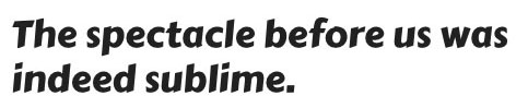
8. Fredoka One
Why it’s great for early readers: Bold, rounded letterforms make Fredoka especially effective in large-print formats, keeping shapes distinct for easy recognition.
Best for: Headings in children’s books, learning area signs, alphabet posters.
9. Imprima
Why it’s great for early readers: Imprima’s simple strokes and even proportions make it highly legible in continuous text for early learners.
Best for: Beginner readers’ workbooks, phonics guides, digital reading activities.
10. Inder
Why it’s great for early readers: With soft curves and wide apertures, Inder is easy to scan and comfortable to read for long passages.
Best for: First readers’ books, sentence-building worksheets, shared reading slides.
11. Josefin Sans
Why it’s great for early readers: Tall x-height and clean geometric shapes give Josefin Sans a modern but clear look, aiding letter recognition.
Best for: Headings in children’s educational apps, posters, activity sheets.
12. Montserrat Alternates
Why it’s great for early readers: Maintains the clarity of the original Montserrat but with playful alternate glyphs for a softer, friendlier style.
Best for: Headings, classroom banners, creative learning spaces.
13. Paytone One
Why it’s great for early readers: Thick, rounded strokes make Paytone One perfect for high-visibility headings without compromising letter clarity.
Best for: Title pages, reading area signs, learning station labels.
14. Poppins
Why it’s great for early readers: Geometric yet soft, Poppins has a wide range of weights, making it versatile for both headings and body text.
Best for: Modern-style learning materials, bilingual print resources, STEM-related reading sheets.
15. Questrial
Why it’s great for early readers: Even stroke weight and open shapes make Questrial clean and highly readable in any size.
Best for: Reading flashcards, phonics posters, digital storybooks.
16. Quicksand
Why it’s great for early readers: Rounded geometric forms give Quicksand a modern yet friendly feel, with each letter clearly defined.
Best for: Digital reading activities, phonics cards, clean educational designs.
17. Righteous
Why it’s great for early readers: Slightly retro in feel, Righteous offers rounded edges and high clarity, great for making headings stand out.
Best for: Book covers, literacy campaign posters, reading challenge certificates.
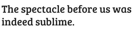
18. Ruluko
Why it’s great for early readers: Simple sans-serif with a tall x-height and open counters, making continuous text easy to follow for beginners.
Best for: Reading comprehension tasks, sentence building, spelling practice sheets.
19. Salsa
Why it’s great for early readers: Fun and bouncy while retaining letter clarity, Salsa engages children’s attention without distorting letter shapes.
Best for: Storybook titles, classroom displays, literacy-themed events.
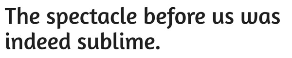
20. Sniglet
Why it’s great for early readers: Wide, playful curves make Sniglet a joy to read while ensuring that each letterform remains clear and accessible.
Best for: Story titles, classroom display boards, fun learning projects.
21. Viga
Why it’s great for early readers: A humanist sans-serif with rounded forms and strong vertical strokes for clear, easy reading.
Best for: Phonics workbooks, graded readers, early chapter book text.
22. Comic Neue
Why it’s great for early readers: A cleaner, modern refresh of Comic Sans with simple, open shapes and a single-storey “a,” making it approachable while maintaining clarity.
Best for: Early learning worksheets, children’s story captions, classroom signage.
View on Google Fonts
23. Bubbler One
Why it’s great for early readers: Light, airy strokes with open counters enhance legibility without feeling heavy or formal.
Best for: Early literacy flashcards, environmental print in classrooms, short reading passages.
View on Google Fonts
24. Lexend
Why it’s great for early readers: Designed to improve reading fluency, Lexend features wide letter spacing, generous proportions, and a single-storey “a” for better letter recognition.
Best for: Dyslexia-friendly reading materials, phonics worksheets, accessible classroom resources.
View on Google Fonts
25. Lexend Deca
Why it’s great for early readers: A balanced weight variation of the Lexend family, offering the same high legibility with a slightly more compact feel for body text.
Best for: Beginner reading books, comprehension sheets, digital story platforms.
View on Google Fonts
26. Urbanist
Why it’s great for early readers: A clean, modern sans-serif with a tall x-height and single-storey “a,” making it approachable yet professional for educational materials.
Best for: School newsletters, student presentations, dual-purpose print and screen reading.
View on Google Fonts
27. Be Vietnam Pro
Why it’s great for early readers: Originally designed for clear screen reading, its open letterforms and straightforward shapes work equally well in print for beginner readers.
Best for: Bilingual education resources, worksheets, educational infographics.
View on Google Fonts
28. League Spartan
Why it’s great for early readers: Bold and geometric with a single-storey “a,” League Spartan is perfect for high-impact headings that remain easy to read.
Best for: Title pages, literacy challenge posters, classroom labels.
View on Google Fonts

29. Syne
Why it’s great for early readers: Wide letterforms and a contemporary design give Syne strong visibility, making it ideal for larger text aimed at beginner readers. Our only reservation is the lower case “g”.
Best for: Headings, display boards, interactive reading activities.
View on Google Fonts
30. Didact Gothic
Why it’s great for early readers: Designed to resemble handwriting letterforms taught in schools, Didact Gothic uses a single-storey “a” and maintains high clarity at any size.
Best for: Alphabet charts, phonics flashcards, early literacy lesson plans.
View on Google Fonts
31. Rammetto One
Why it’s great for early readers: Thick, rounded letters make Rammetto One a fun choice for headings while keeping each letterform distinct for easy recognition.
Best for: Learning area signs, literacy event posters, bold classroom headings.
View on Google Fonts
32. Poiret One
Why it’s great for early readers: Light and geometric with a friendly tone, Poiret One’s single-storey “a” supports letter recognition while offering a modern aesthetic.
Best for: Reading corner signage, creative learning resources, educational branding.
View on Google Fonts
33. Lexend Giga
Why it’s great for early readers: The widest weight in the Lexend family, Lexend Giga maximises spacing and letter clarity for readers who need extra visual support.
Best for: Special education reading materials, early reading apps, large-print resources.
View on Google Fonts
For more inspiration and font recommendations, explore our related handwriting guides:
- Best Cursive Fonts from Google for Learners & Beginners
- Best Dotted Fonts and Guides from Google Fonts for Handwriting Practice
- Move over Comic Sans – Best Fonts to Use for Learners & Beginner Writers
If you find this resource useful, please share it on.